Powerful Visualizations
Interrogating large databases can be complex and time-consuming.
Your sample data comes to life when it is visualized with ArDB.
ArDB allows you to quickly group, filter and organize your analytical results making it simple and fast to visualize your data in grids, 2D Charts, 3D charts, and geographical maps (GIS).
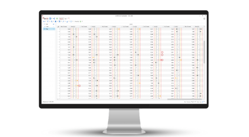
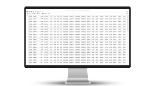
Grids
When constructing, maintaining or managing your database in ArDB, most of your work is performed in the Grid View.
The grid is the work-horse of any database management tool and provides an easy way to manage your sample metadata and results.
The Grid View is where every associated result with a particular sample can be seen alongside other metadata such as sampling date, GPS coordinates and sample ID for example.
It supports all the features you would expect, including sorting, grouping, paging, and customizations.
In ArDB the grid is heavily customizable and allows for Calculation results to be visualized directly within the grid intuitively (For an example, see Quality Control).
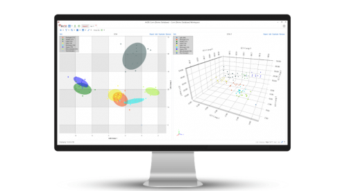
Charts
ArDB makes it simple to isolate the specific sample analytical results that you need for your analysis.
Large data sets can be reduced using the grouping functionality which aggregates all samples in a particular group to yield average values.
With your samples of interest filtered from the rest of the database, you can begin to uncover the stories hidden in your data using the Charts View.
The charts tool in ArDB is simple to use and quick to manage.
ArDB supports scatter, line and column charts in both 2D and 3D so that you can visualize your data how you need to.
All charts are fully interactive and support annotations such as trend lines and confidence ellipses.
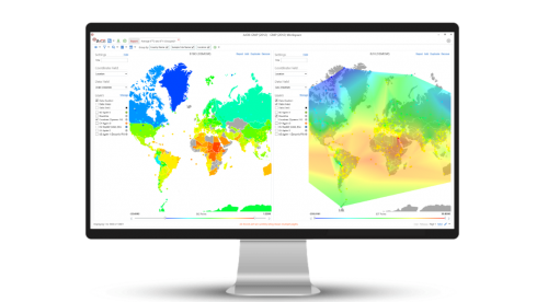
Maps
The geographical origin of a sample can be of crucial importance to your data analysis.
ArDB is a powerful Geographical Information System (GIS) allowing you to plot any number of sample results on a map using sample GPS coordinates.
This lets you interrogate spatial variation in your sample results.
Using ArDB as a Geographical Information System (GIS) along with the Smart Date filter allows you to evaluate spatial and temporal (daily, monthly, yearly or seasonal) trends in your dataset which is ideal for long-term studies at sampling sites.
The map feature uses color gradients to be able to easily see variations in data and the color scale can be easily manipulated to filter results between certain values.
When plotting points on a map, the map feature will plot all points discretely but it is also able to interpolate between data points to calculate a predicted value.
This is extremely useful when a geographical data point of interest is not in your database but you would like to estimate the result.
ArDB supports a suite of some of the most well-known map background imagery sources.
Maps can be further customized by including "Shape" files, which describe features such as geographical boundaries, rivers, lakes and roads using points, lines, and polygons.
Reports
When you have finally got your data organized and you are happy with the visualizations you have created, it is time to think about generating a report for your samples.
The Reports View allows you to bring all of the above elements into a single screen giving you a 360-degree view of your data.
Any visualization can be sent to the Reports View. Each element remains completely interactive and can be positioned and resized easily to give you the visibility that you want.
From the Reports View, it is possible to submit "Test Samples" (unknown samples) allowing you to investigate how these samples sit within your known database.
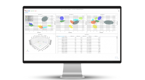
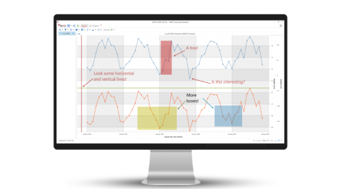
Chart Annotations
Annotations is a very useful feature that allows you to highlight interesting chart features.
You can annotate your charts with
- Lines
- Arrows
- Boxes
- Text
- Horizontal Lines
- Vertical Lines
All annotations can be easily customized and refined.
You can continue interacting with your chart, by zooming or panning in the usual way, and your annotations will remain anchored to your data and automatically update.
Annotations are saved as part of the chart and workspace for straight-forward and easy sharing.
Furthermore, annotations are automatically included when saving the chart as an XPS vector image.
Calculations
Use Principal Component Analysis (PCA) or Linear Discriminant Analysis (LDA) multivariate statistical techniques to produce informative statistics and visualizations that help classify your results.
Use the Quality Control Statistics calculation to quickly and easily monitor the quality of your results and flag potential problems.